The previous website was very plain, mostly gray due to the logo, lots of white space and very little color. When a new VP of marketing came in he wanted things to be much brighter and bolder so, that it really stands out.
We choose a bold and bright solid blue as a main color. The header image was rotated every so often with a yellow background image and the tag line was almost always from a press release.
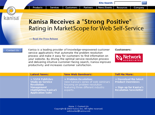
Kanisa Corporate Web Site
The previous website was very plain, mostly gray due to the logo, lots of white space and very little color. When a new VP of marketing came in he wanted things to be much brighter and bolder so, that it really stands out.
We choose a bold and bright solid blue as a main color. The header image was rotated every so often with a yellow background image and the tag line was almost always from a press release.