I started with the current Kanisa corporate look and feel and switched the blue/yellow colors with a red/yellow theme to match the St. Frances hotel in which the conference was taking place. Since most users were traveling to San Francisco for the conference we wanted to highlight the travel and discovery aspect of the city itself using an array of stock photos from Getty Images.
Seen here is the web design for the conference home page. Each interior page had a similar but simpler header design using variations of only 3 of the images at a time. This same general look and feel was carried out on all other materials for the conference, brochures, signage and html emails.
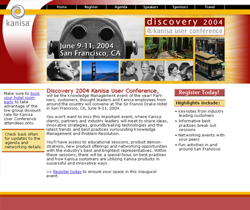
Kanisa Discovery User Conference Web Site
I started with the current Kanisa corporate look and feel and switched the blue/yellow colors with a red/yellow theme to match the St. Frances hotel in which the conference was taking place. Since most users were traveling to San Francisco for the conference we wanted to highlight the travel and discovery aspect of the city itself using an array of stock photos from Getty Images.
Seen here is the web design for the conference home page. Each interior page had a similar but simpler header design using variations of only 3 of the images at a time. This same general look and feel was carried out on all other materials for the conference, brochures, signage and html emails.